The 'Beige' Psychology: Why Neutrality Signals Wealth
The 'Beige' Psychology: Why Neutrality Signals Wealth
In a digital landscape screaming with neon notifications and high-saturation filters, the ultimate flex is silence. The Kardashian pivot to a monochromatic, beige palette is a masterclass in 'Quiet Luxury' psychology.
The Visual Silence
Beige, taupe, and espresso are not just colors; they are signals of stability. They suggest a life so controlled and curated that it is immune to the chaos of the outside world. It is the visual equivalent of a private jet—detached, exclusive, and calm.
Old Money vs. New Money
Historically, bright colors were a sign of 'New Money' trying to be seen. 'Old Money' whispers. By adopting the palette of architectural stone and unbleached linen, the family rebranded themselves from reality TV stars to American royalty.
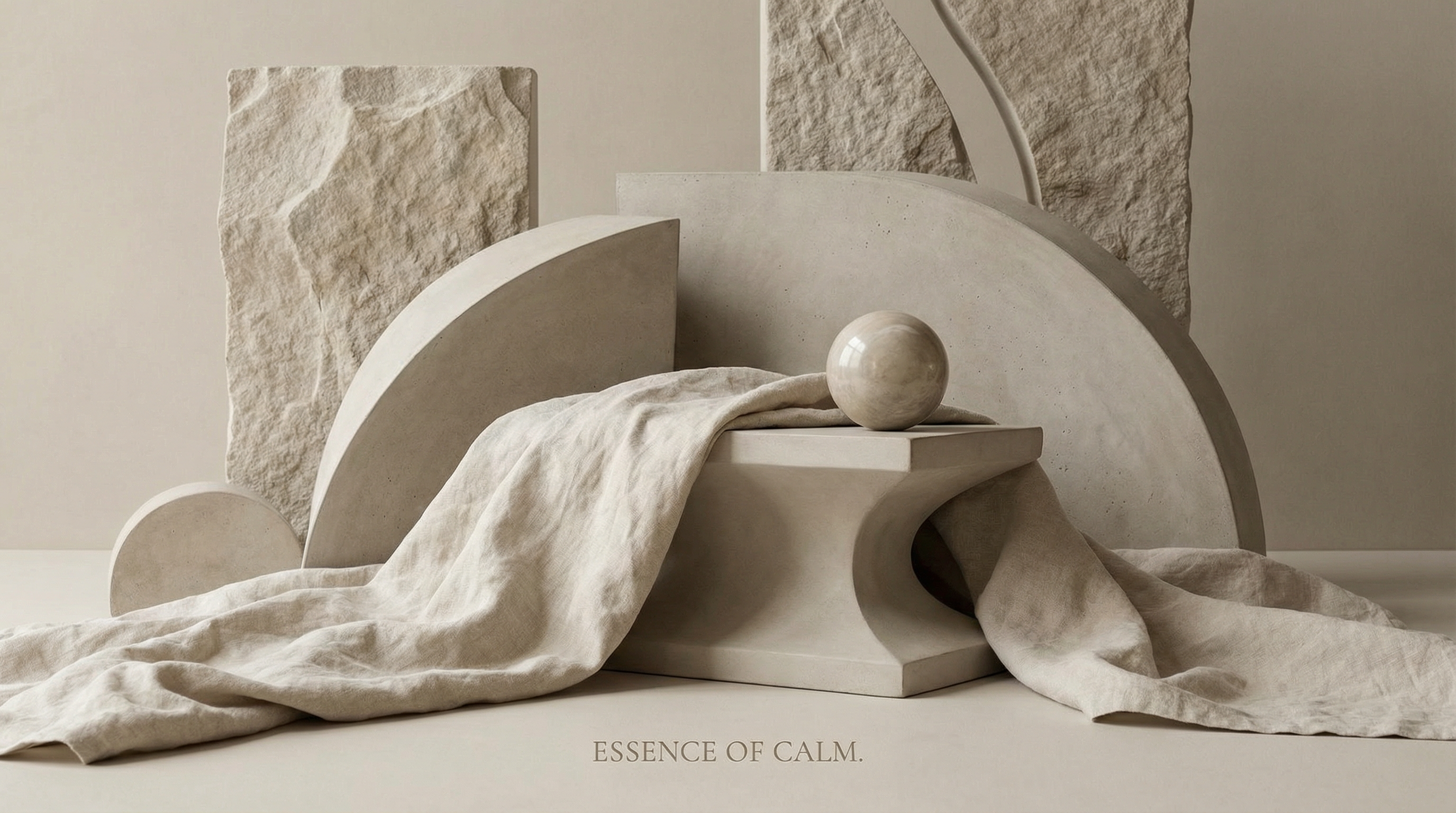
Case Study: SKKN by Kim
The packaging of SKKN is indistinguishable from a brutalist sculpture. It doesn't scream 'buy me'; it sits on your counter like an artifact. This elevates the consumer's own self-image, making the product a status symbol of their own taste, not just a utility.
Strategic Playbook: How to Apply This
- Audit Your Palette: Does your brand scream or whisper? If you want to charge premium prices, reduce the saturation. High-contrast black and white or monochromatic earth tones signal confidence.
- The 'White Space' Rule: In your designs, increase the negative space by 30%. Clutter signals anxiety; space signals abundance.
- Texture over Color: Replace bright colors with rich textures (matte, grain, stone). This adds depth and perceived value without adding visual noise.
Psychological Insight: Cognitive Fluency
Simple, monochromatic designs are easier for the brain to process (high cognitive fluency). This ease of processing creates a positive emotional response, which the brain misattributes as 'truth' or 'quality'. We trust what is easy to see.